
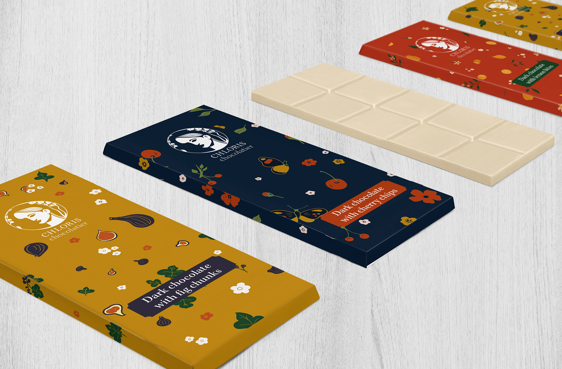
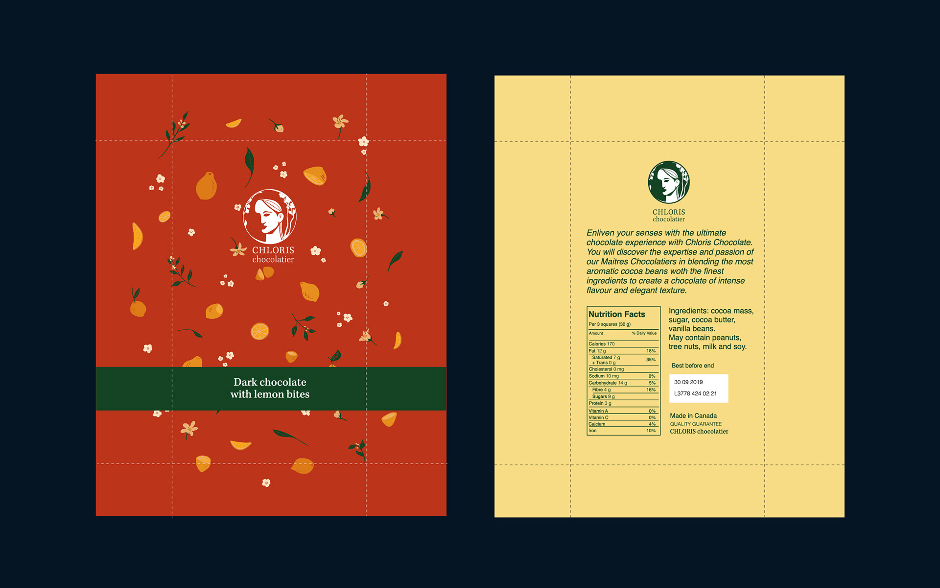
In this project I created a package design for a chocolate company. Chloris Chocolatier produces Chocolate bars with 3 fruit flavors (cherries, figs & lemons).
I used simple illustrations of fruits and their blossoms for the package. This way clients can distinguish the flavors of chocolates and the chocolates will stand out in the shelves of retail stores.
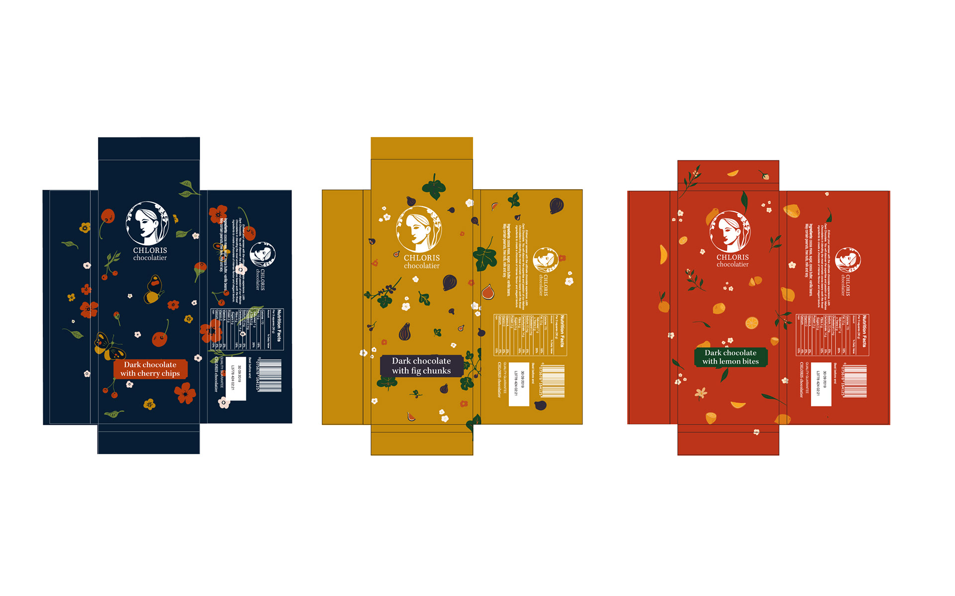
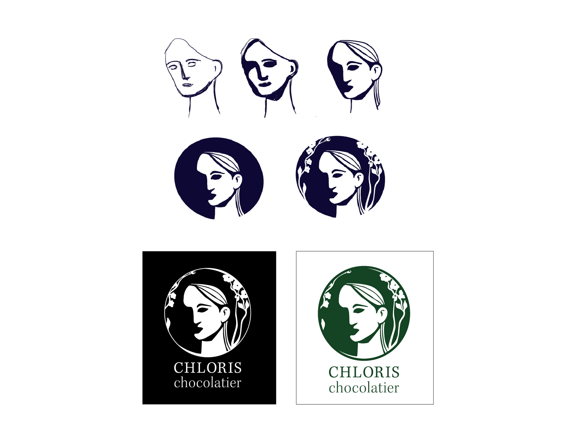
I also developed a logo for the company. Chloris is a Greek goddess of spring and flowers. I was inspired by statues of the Chloris and created a logo with a face of Chloris that is shaped in circle with flowers. The face on the logo should always be used in white color and the negative space should be a darker or saturated color because it works as a shadow on part of her face and a background. On packages the logo should be in white and negative space in color of the package.
The name of the company as part of the logo is written with Serif font Kepler STD Display which gives a clean and delicate look for the logo.
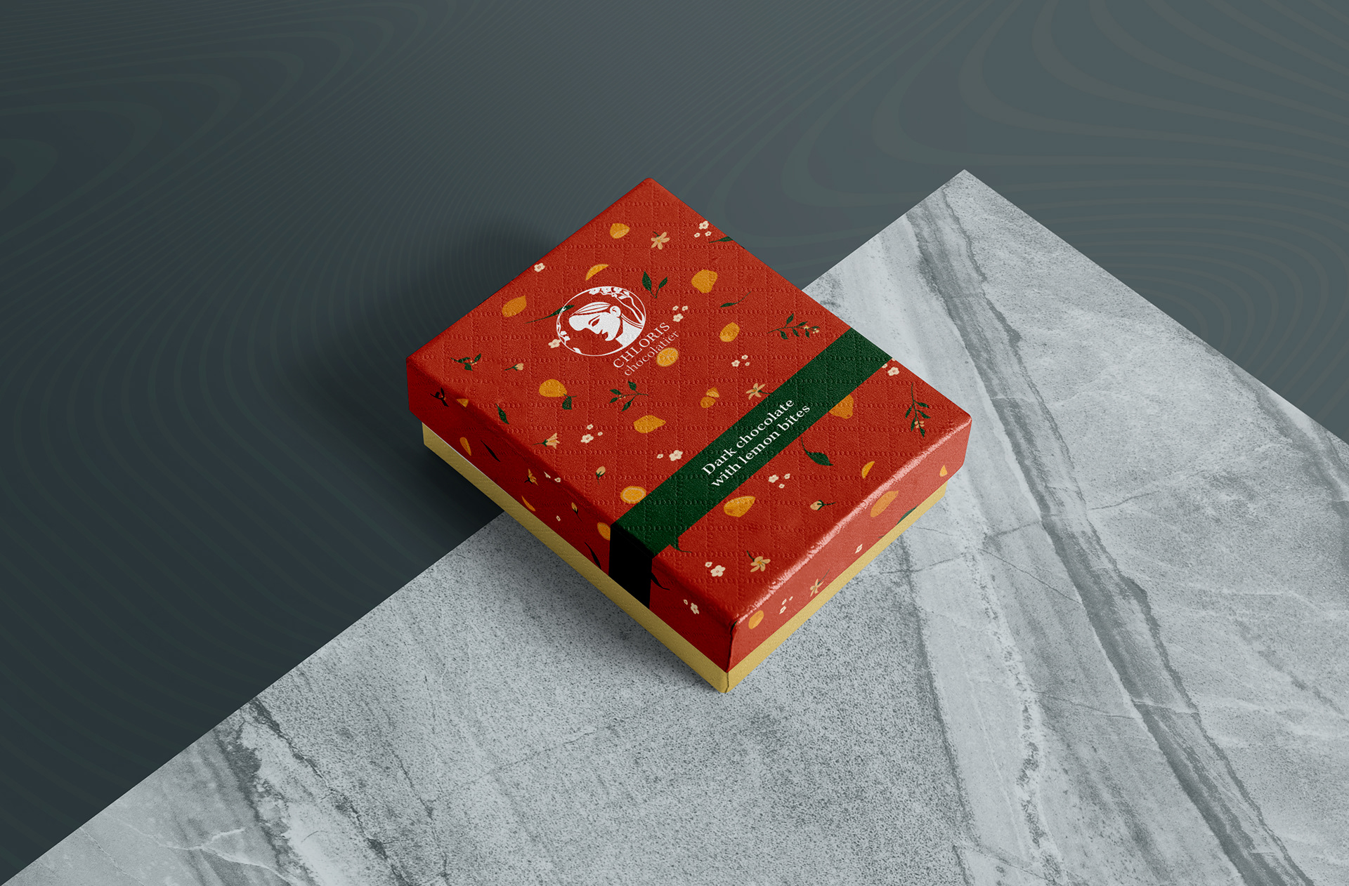
There is also a gift package in a thicker box. The top of the box has the same illustrations as in original package. The bottom of the box matches the color of the fruit flavor.
Gift package
Gift package layout design
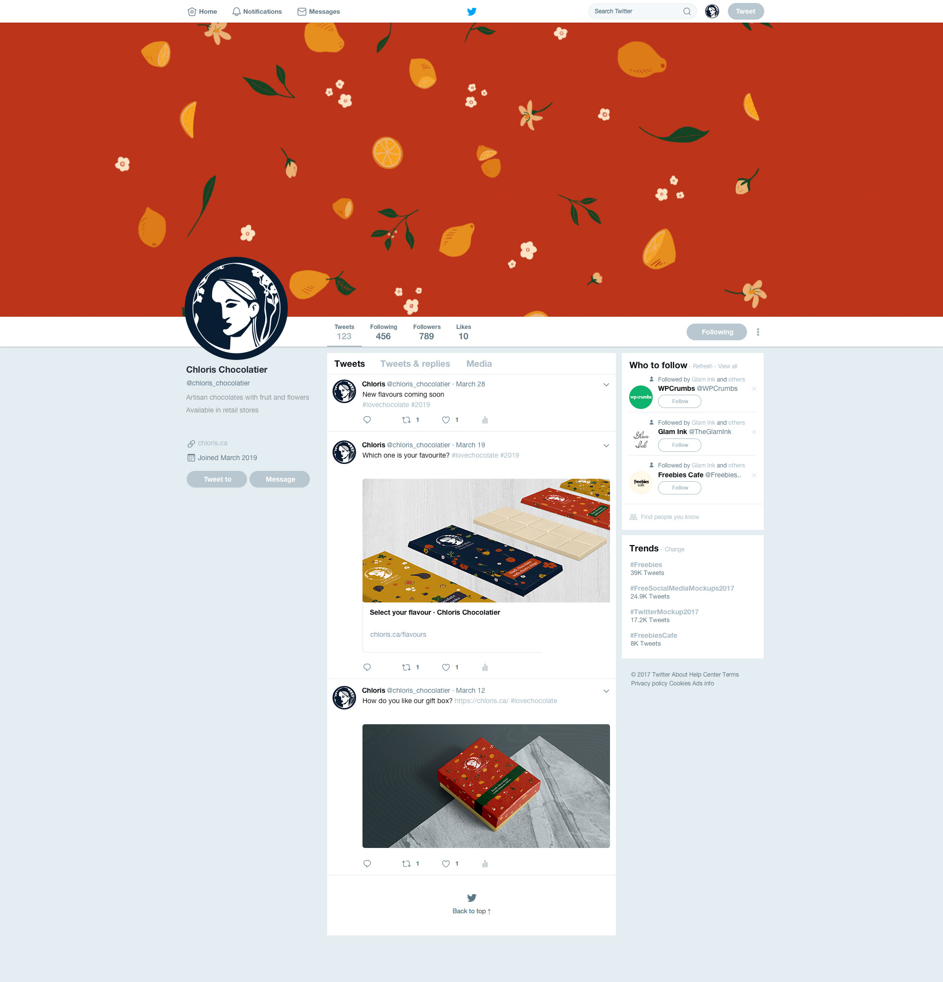
The circle shaped logo also works well on social media profile pictures.
I created the illustrations on Procreate
Everything else created in Adobe Illustrator